(Case study) — HealthTech · Product design · Desktop app
Swash
Desktop application design for monitoring breathing quality.
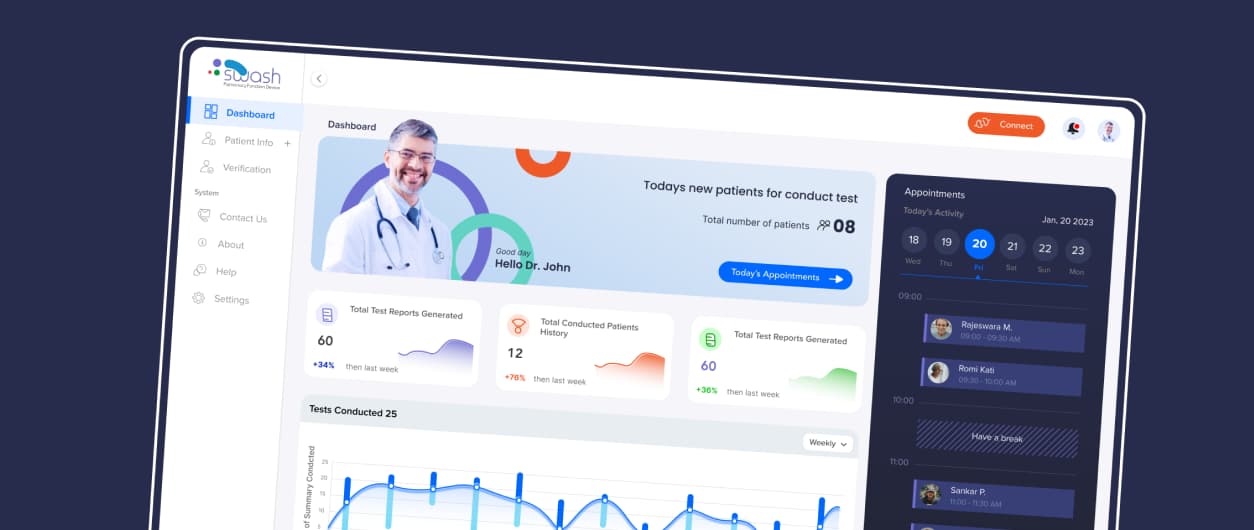
Swash is installed on a doctor’s computer, connects to a pulmonary device, collects patient demographics and vitals, and stores them securely in the cloud.
Product design · Icon & illustration · UI/UX design
- Client
- Swash — pulmonary function device
- Role
- Product design, UI/UX, icons & illustration
- Platform
- Desktop application
- Users
- Doctors & technicians
Design process
- 01Understanding requirementsGathered requirements from stakeholders to understand the objectives, user needs and features the dashboard had to support.
- 02WireframingLow-fidelity blueprints of layout, content placement and navigation to validate ideas and align the team before visual design.
- 03Visual designColour, typography, icons and spacing — a look and feel that improves usability and carries the brand.
- 04PrototypingInteractive models of key flows to test early, gather feedback and refine the experience before development.
Project introduction
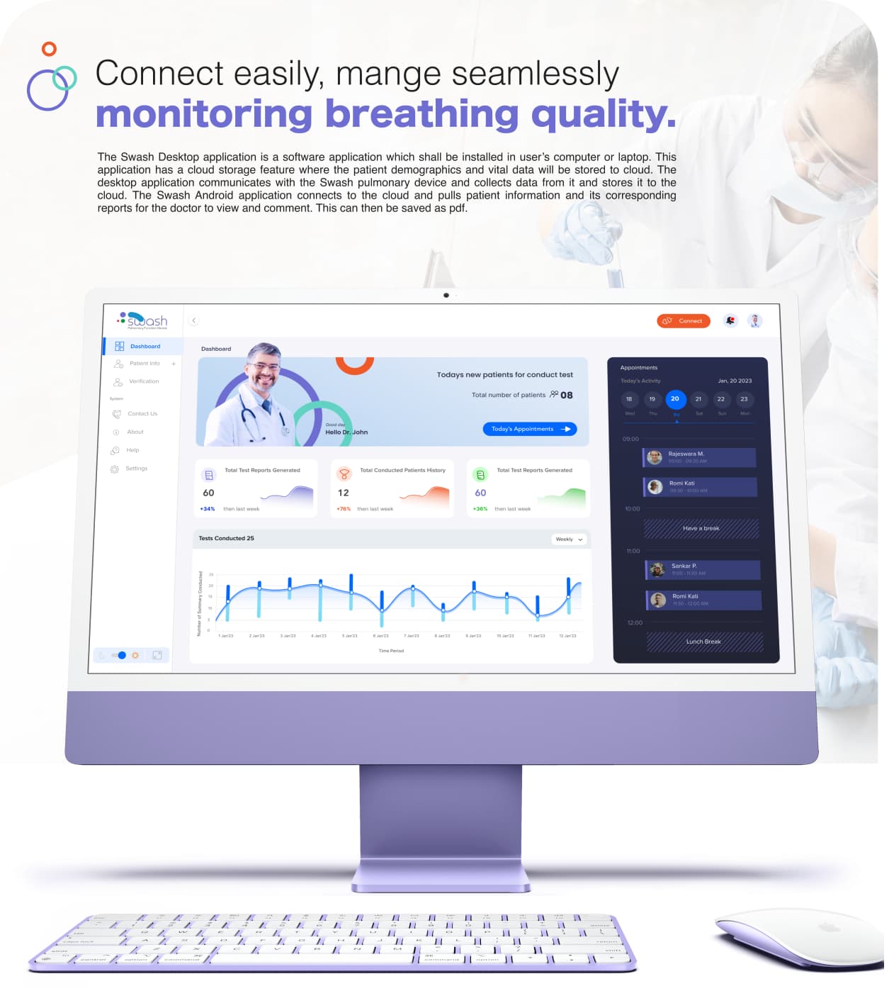
Connect easily, manage seamlessly — the desktop app talks to the Swash device, and an Android app pulls the same reports for doctors to review, comment on and save as PDF.
Clarity & efficiency flows
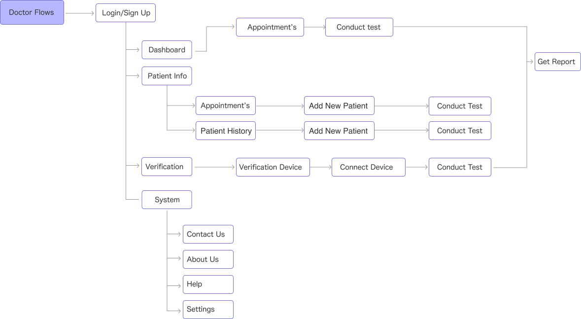
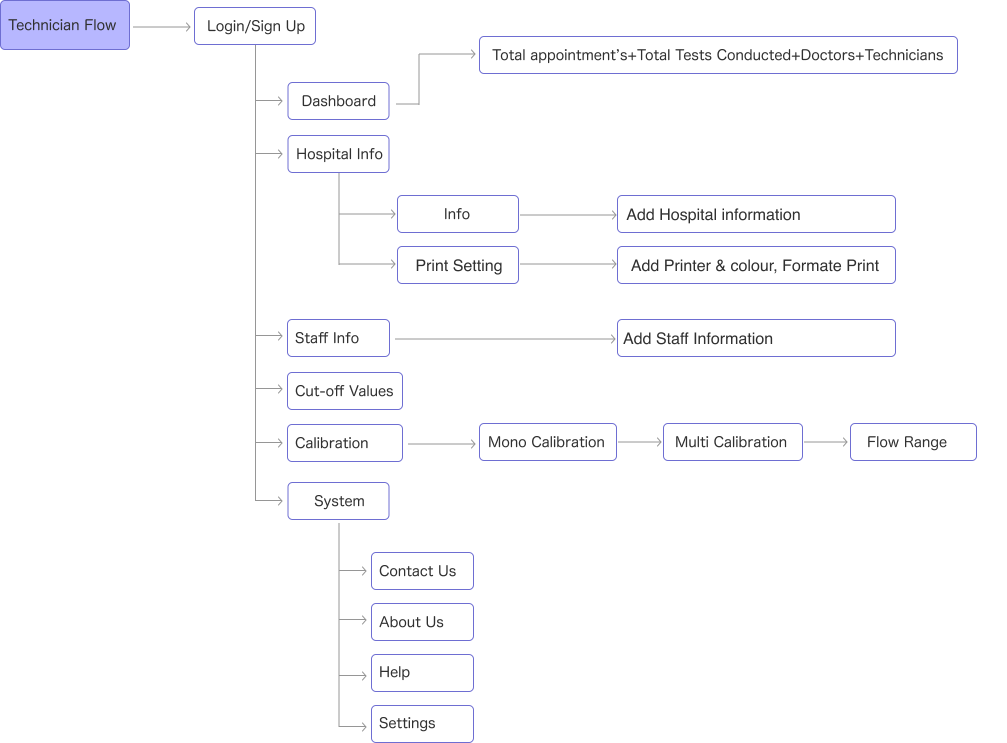
Two roles, two journeys: doctors run tests and read reports; technicians set up hospitals, staff and device calibration.
Doctor flow
Technician flow
Precision design with grid
A 12-column desktop grid with a fixed sidebar keeps dense medical data aligned and readable.

Branding guide
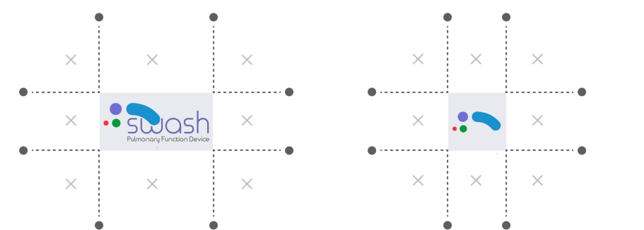
Clear-space rules for the full Swash wordmark and the compact symbol.
Keywords that describe the brand’s character — the words Swash wants to be associated with: caring, precise, calm, trustworthy.
Typography & font
Hiragino, in medium and bold, for a clean, clinical and friendly voice.


Colour palette
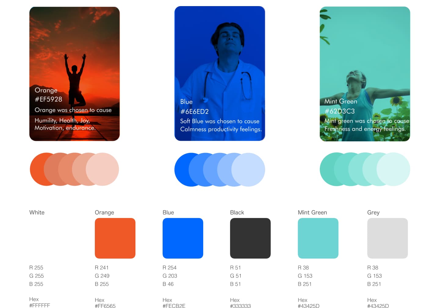
Orange for motivation, blue for calm productivity and mint for freshness — balanced with charcoal and grey.
Design system
The Swash UI kit — toasts, controls, outline and dual-tone icons, uploads and stat cards for a cohesive, striking interface.

Final screens
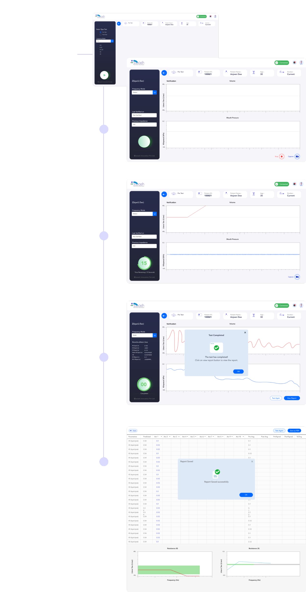
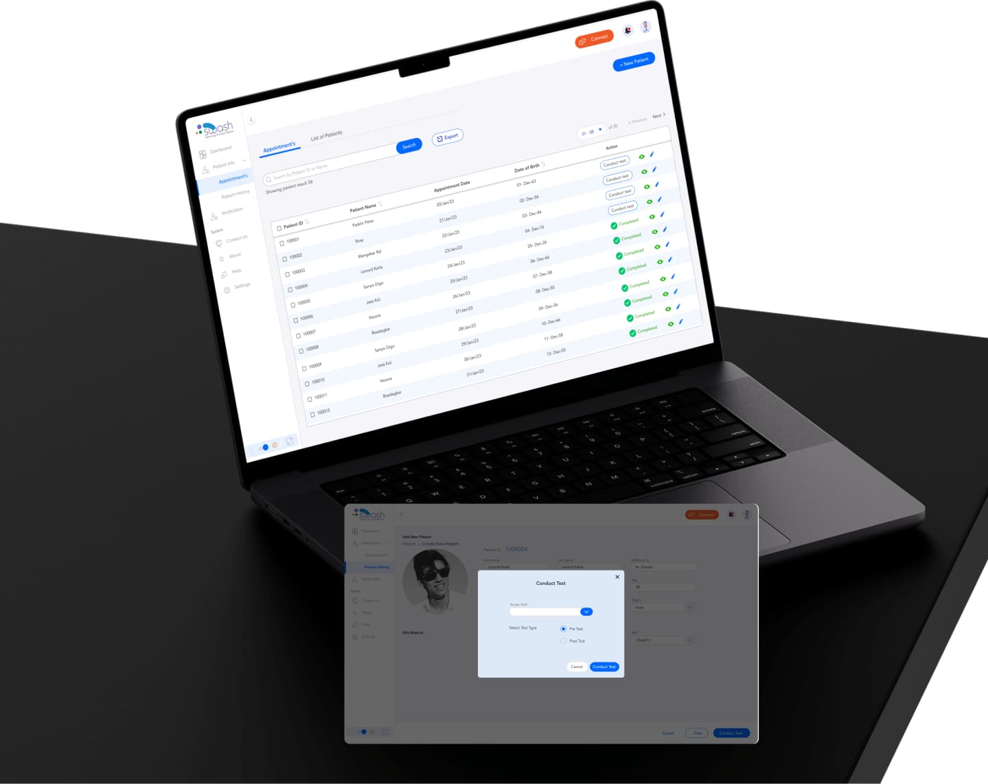
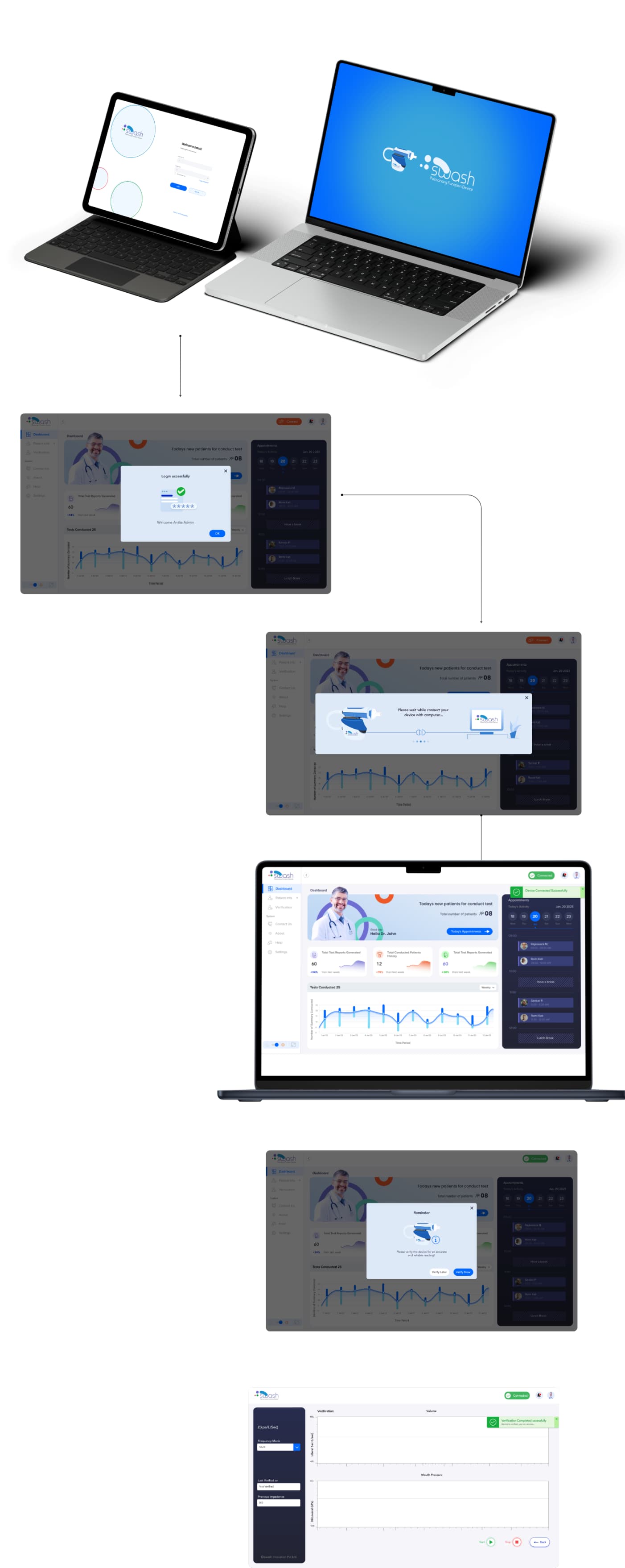
From login and device connection to appointments, patient lists and conducting a test.
Login → connect device → verify
Conducting test
Select test type, run the timed test with live volume and mouth-pressure graphs, then review and save the report.